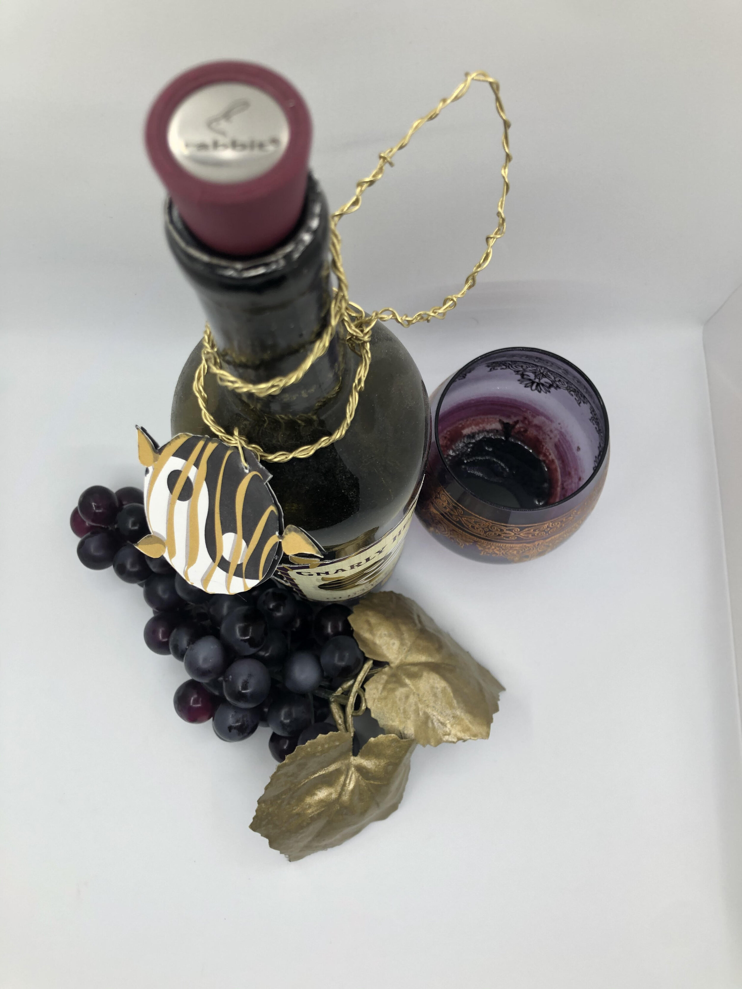
Gnarly Head Old Vine Zin
Gnarly Head Cellars, in Manteca, California, used imagery of their unique free standing, Lodi grape vines on all of their wines. While successful in communicating their differences from other vineyards, it makes the bottles blend together and fall back on the shelf.
I decided to create something new for their Zinfandel. I first played off the word zin, sounding similar to zen. Gnarly Head grows their vines with traditional techniques and “free standing” vines. With this in mind I wanted to use some common imagery associated with a place of zen and inner freedom.
Through the gold and purple color scheme I also wanted to communicate a sense of class and elevate the presentation of the bottle.
Lastly, I created a gold vine, to tie into the art on the label, out of wire to wrap around the neck of the bottle and hold the tag. This feature gives the bottle some extra dimension and immediately makes it leap off the shelf.
Above is how the bottle would be displayed or seen on a store shelf.
Close up of the front label and art work.
Close up of the back label, the vine design carried throughout the design.
The hanging tag of a vine set the bottle apart from others and creates a point of interest for consumers.


